PlumX Dashboard Extended with New Visualizations & Analytics
We are thrilled to release the first version of our new analytics reporting feature, PlumX Analytics. From the beginning, our vision was to give people who perform, support and fund research easier ways to answer their questions and tell the stories about the research. This new feature is the next big step in delivering on that vision.
What is PlumX Analytics? We take all of the great data we collect across our five metrics categories (Usage, Captures, Mentions, Social Media, and Citations) and roll it up into visualizations that customers can use to better understand the stories underneath the data.
For example, you might be curious about the differences between research output based on publication year. Here’s how that question is answered for one customer:
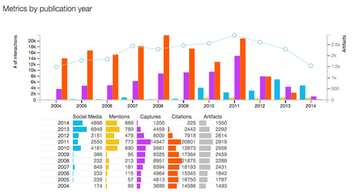
The Metrics by Publication Year report is a classic pivot table, combining artifact counts (the line across the bars) with the interactions for each year’s publications. This visualization technique allows us to represent two different types of data, in this case measures of overall productivity alongside the categories of impact, to allow for at-a-glance understanding across an entire institution’s research output. By looking at the metrics by publication year, it’s easy to see the rise of social media interactions with newer publications, while the citation counts lag for that same set. While it takes citation counts 3-5 years to accrue to any meaningful measure, the other categories that PlumX tracks can lend insight in near real-time.
The ability to look at data this way has many benefits. A few examples are:
- Assisting with new grant applications
- Gaining insight on which research areas gather the most social impact versus the ones that garner researcher attention
- Identifying where there might be gaps between output totals and usage
These benefits will grow as we add more analytics and visualizations based on customer feedback and insight.
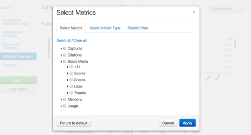
This first version includes ways to visualize metrics for the entire institution, individual groups within a customer’s PlumX hierarchy, researchers and artifact types. Customers can easily use these charts in presentations or reports by downloading them in PDF or image (PNG) formats.
Additionally, this tool is interactive, allowing users to filter the data any way they want and have the charts update immediately.
Users with admin privileges for a customer site can begin using the feature immediately. It is accessible from the main dashboard for any researcher or group using the “Analytics” button above the data table for that group.
To read the press release go here.
To request more information about Plum Analytics go here.