PlumX New Features for Navigating Metrics
In our latest release of PlumX, we have made improvements to the display metrics of the impact of artifacts, researchers and groups they are affiliated with. Highlights include:
- metrics previews when searching for a researcher,
- a significant redesign to make the metrics on the data table more digestible,
- and some back end data merging improvements that allow us to present more complete metrics about each artifact.
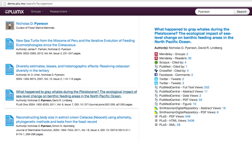
Metrics Preview When Searching
When searching for a researcher in PlumX, the result list now has a preview of the metrics associated with each item on the result list. At a glance, you can now tell about the engagement of each item before clicking through.
Data in Bite-Sized Chunks
As we progress, we strive to make data both actionable and transparent. We now allow for exploring the 5 categories of metrics (captures, usage, mentions, social media, and citations) in the view of all articles in a collection. We provide summary metrics for each artifact, so you can quickly analyze these categories in relation to one another. This summary view is available for both individuals as well as entire collections (such as all of the research output for a university.)
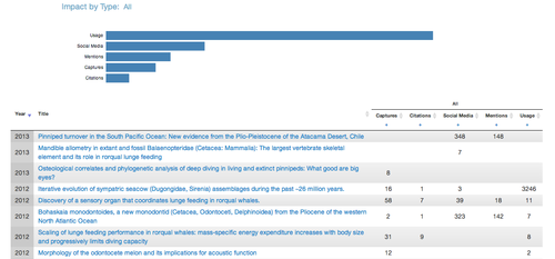
Within each category, you can expand (by either clicking on the bar chart or the + at the top of the column) to see more detailed metrics about the category. Look for even more enhancements coming to this area soon.
Multiple URLs? No Problem.
With scholarly communications, the same article can be published in multiple locations on the web. Plum collects and displays the counts from each of these individual locations, allowing users to get a full view of the engagement surrounding a particular article, video, presentation, etc.